NATT'S DESIGN JOURNEY
DES200 - Poster & 3D Model

Note:
There are aspects I would improve if I were to work on this project again, such as aligning the chicken with the background. Additionally, aligning the vertical writing with the exact angle of the chicken.
I also ensured the translation was correct with the help of a fluent Chinese speaker.
Final Poster
Context:
We were to select any item and culture of choice, and it had to connect with our childhood. Therefore, I decided to opt for something simple, like LEGOs. However, that had no strong connection with my childhood. Therefore, I combined LEGO with something that also contains blocks, such as Minecraft. I used to watch Minecraft videos constantly, since the age of 11, and even considered pursuing my dream of being a Minecraft YouTuber. Onwards, I chose a baby chicken as my item from Minecraft and converted that into a LEGO chicken. I created the 3D modelling on Rhino 7 software.
I analysed the colour scheme for the chicken, aiming to match a specific culture that associates with those colours: red and yellow. Therefore, I decided to go with Chinese culture.
Case Study
Here are the inspirations/case studies before the poster design process. These are ways to provide me a boost start.


Design process (ideating & developing)
I created a quick drawing illustrating how to design the Minecraft chicken logo and what features to include.

While drawing, I figured out how separating the chicken components would help simplify the assembly process.
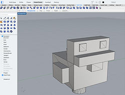
To create the chicken, I had to utilise my basic 3D modelling skills, combining multiple shapes. Surprisingly, it was simpler than I anticipated, due to the combine and erase tool. The tool helped with piecing the logo together, including the holes and engraving of the logo title. It also featured a rendering tool that enabled the inclusion of materials, such as plastic, resulting in a realistic outcome.

Explosion View


Top Views


Front/Right Views


Side and bottom Views


Rendered Images:
I then implemented the LEGO Minecraft chicken into the poster. This is where the Chinese cultural element comes into play. To portray the cultural aspect, I incorporated lanterns, Chinese typography, and colours. As mentioned before, the aim is to identify similarities between the two things, whether there are items within the Minecraft editions/mods or traditional colours in China.
These chosen items are then associated with the LEGO design style approach.
I began with quick sketches, conveying ways I could present my chosen item.


I continued to modify the ideas digitally, simplifying the critiquing process, as it incorporates colours and drawing layers. To understand better, I digitally created the concept ideas using Photoshop as my software tool. I also included the pros and cons, both my self-critiquing and feedback from others, to avoid designing based on my biased opinions. Click on images to view the pros and cons.
Note:
I considered the typography, "build your imagination", as Minecraft and Legos encourage that. I also had in mind the childhood objective. Therefore, this could also spark the viewers' creative journey, much like how I began my passion for art and design.


After collecting feedback, I chose the red and yellow poster as the next step (number 3). However, the colour matching was making the developing process a little complicated, considering the lack of visual hierarchy. I chose to lighten the two primary colours and work with the compositions, so the chicken can be the focal point. I also considered the angle of the chicken. I used that to create a link with the items and the background of the poster.

Development Designs:
With feedback and self-reflection, I decided on the first design. I liked the diagonal style and the cross-impact it delivers. However, the finalisation step was most certainly a difficult one.
Quick reflection:
Although this was the final poster, some people still found it difficult to focus on the chicken, specifically referring to the colour scheme and selected elements. To clarify, the chicken is the focal point. The colours and art style are all influenced by Minecraft and Legos. The Chinese culture helps support that, due to the similarities they share; Hence the lantern and colours. Also, lanterns are found in some Minecraft mods. Considering the two elements could be too matchy, the incorporation of Chinese writing is used to visually inform viewers of the cultural aspect of the poster.
These points will be areas for improvement in the future of this poster, as I shouldn't have to explain something that the poster should visually communicate.