NATT'S DESIGN JOURNEY
DES232 - Who Kneads Logo Design

Note:
This is a group project. All ideas and decisions were made collectively. However, I will only present the work I have contributed.
Final Logo
Context:
For this assignment, the objective is to create a food-waste-reducing product design that utilises minimal materials while also benefiting the local community. Our creation aims to have a positive impact on our target audience: individuals who are homeless and need support feeding their families/themselves. We chose to create a small bakery, specifically a bread stand, for use after hours. Instead of throwing away the baked goods, we continue to provide them to those who struggle financially. And with the remaining bread, we partnered with Brothers Beer to create bread beer. We ensure there is no waste in our project.
We were allocated our own section, with me in charge of marketing and some graphic design (including the logo). I sketched and used Photoshop to design the logo.
Note:
I will focus solely on the logo design for this entire assignment.
Design process (ideating & developing)
In the initial stages of this logo process, I gathered inspiration images influenced by the whoKneads website and moodboard. The logos will maintain the same colour aesthetic to ensure continuity with the other elements. The process also determined the typography font we will implement in our logo. I also considered incorporating all teammates' feedback to ensure the inclusivity of all our ideas.
Note:
Our goal is to create a warm, welcoming, and minimalist aesthetic for our logo.
Colour Scheme

Colour Scheme
After our group discussion, we realised that the beginning colour scheme had no "pop" colour. Therefore, while continuing the warm aesthetic, we considered incorporating a teal green colour. Following with rematching the brown shades.


Final Colour Scheme
Font
Fonts
For our font, we initially considered implementing the Gabriella font into our logo. However, after trials and group feedback, we agreed that it did not achieve our expectations of being as welcoming and warm. Hence, with this change of mind, we decided to use the Poppin fonts, which are more associated with our aesthetic and concept. Moreso, it didn't give an overwhelming invitation. We understood that sometimes simple is better.
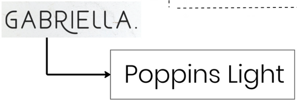
Final Font


Logo inspirations
As for the concept sketches, I considered trying motif designs, specifically bread, our primary element.

With the feedback from our UX Designer, I explored the motif design method with a question mark, delving deeper into the "who?" of our project's title. However, I still maintained the bread element to ensure our primary product is still communicated.

With more feedback from the entire group, we agreed to combine the styles of both motif designs. The modifying feature is to take a more simplistic and minimalist approach. However, the group was leaning more on the bread logo designs, as they saw more potential for its use with our product and connection to our website.


Logo inspirations
Note:
The group's manager provided these inspirational images above. The following sketches continue to communicate the bread motif and the raw sketch feature.

Repeating the modifying and feedback processes, we decided on the project title to be between the curvy lines. Following this style creates a more concise and organised appeal to the viewers, and it enhances the link between the website, which has elements of curvy lines.


Note:
The logo will be used on different-coloured backgrounds, given the multiple finals (website, poster, and prototype).