NATT'S DESIGN JOURNEY
DES200 - The North Wing Website/Logo Design
Final Website
Note:
Every process in this project has contributions from all group members. However, I will only be presenting my work.
My participation in the group project:
I was responsible for designing the UX/UI aesthetic and functionality. I had to maintain that link to our case study and the NZ Air app to create a smooth transition (achieved mid-process). The aesthetic of the app we decided to keep is simplistic and naturally vibrant, aiming to captivate users with the visuals and enhance the app's usability. Regarding the composition, I underwent the ideation, feedback, and iteration process to achieve the final outcome. I also designed the penguin character mini game and the quiz game. I also created the logo design.
The North Wing is a group project for potential collaboration with NZ Air. We began with a case study, 'NZPI' (New Zealand Penguin Initiative). The primary objective was to ensure the safety of our endangered penguins. As the issue developed with tourists, we finalised our decisions to connect with NZPI and NZ Air. These considered partnerships have frequent associations with our target audience (tourists of all ages), primarily due to NZ Air, which consists of many passengers exploring New Zealand. This could provide an opportunity for them to use their platform to enhance awareness of the NZPI's foundation. Therefore, displaying our app on every plane could inform our international passengers about our wildlife and the help they can provide for a safer habitat for our penguins.

Platforms
Design process (ideating & developing)
The app comprises the main elements: the VR world, the quiz, the information page, and the storyline. The VR 360 includes information about the penguins and their lifestyles. In addition, we also have a linked quiz that encourages tourists to educate themselves more about NZ penguins with a more intriguing approach (to test their knowledge). The information page is designed to help you learn without fully committing to lengthy activities. We didn't forget the younger audience! We want to ensure the younger generation is aware of the current conditions of penguin lifestyles. We designed a mini storyline penguin animation to achieve this, providing a fun learning experience. We hope these elements positively impact our tourists, providing the boundaries and protection our penguins deserve.

The moodboard helped us understand our primary goals: our audience, aesthetic, and the approach we want to achieve, which is supporting New Zealand's penguins through our partnership, 'New Zealand's penguin initiative', and also building awareness for our tourists.
I then created some quick drawings of the app components and took notes to support the ideas, clarifying the prototype's functionality and the thought process behind it. The drawings portray the stages of development, including feedback. Ideas have changed drastically as we have progressed in creating this app.

The penguin character might permit the user to interact with it - looking after it. Similar to how we want to protect and look after the NZPI penguins.
The penguin character might permit the user to interact with it - looking after it. Similar to how we want to protect and look after the NZPI penguins.
Some of the features in the game will be functional. There might be the max of seven questions. All options might also be available to choose. Again, it matters on the time.
Home Buttons will be all functional.
The logo square might be a button that slides out the educationsal and penguin related games
The 'check the answers' button and the 'correct/incorrect pages' (not included in the rough sketch) are all functional.
The QR codes would navigate to either the VR space or the NZPi website.


For the prototyping process, we decided on using Figma and Photoshop.

Development One
In the design above, here are the points we reconsidered:
- Removed the sliding technique for the languages due to being out of place when compared to the primary composition of the app. We considered using a scrolling technique.
- Removed the age selection page due to the app being for all ages.
- The quiz aesthetic was too repetitive and boring to maintain the users' interest. Therefore, the group finalised by trying a different design approach.
- The composition of the rectangle shapes used for the quiz questions didn't sit well, due to the lack of balance of negative space. So, we decided to centre the elements.
Overall, with the feedback from our group, we also discussed refining every page by modifying elements that are randomly placed on the page, such as adding relevant boxes, lines, or images, which could simplify navigation and improve clarity for the user. Otherwise, removing any unnecessary boxes, colours, or spaces that make the page too complex.

I had modified the pages, including the home page, partnership page, and quiz pages. I designed different iterations on how we could create the quizzes while also incorporating the penguins from the main page (maintaining the link).
The initial idea was to follow a simplistic vibe, as illustrated in the mood board. However, feedback mentioned the importance of maintaining the aesthetic and composition of the NZ Air website. Therefore, without completely restarting, we developed a more cohesive website style incorporating the elements we had previously.
This was specifically directed to the homepage ;-;.
(Note: Team member drew the cute penguins for the homepage.)

(Lake, 2020)

Development two

Development three

The final version of some main pages:

To improve the kids' storyline mini-game, I would consider including an element that subtly conveys the danger of invading the habitats of these penguins. A feature that allows the children to push away the harm and invite nurturing. The reason for the additional idea is due to the possible misdirection when taking care of the penguin. We would want the kids to understand the penguins need to be taken care of, but only from afar and through a screen, not in the real habitat.
For future reference, consider adding a simplified version of the information about the penguins so that the kids can better comprehend it.
However, the aesthetic and overall idea are adorable.

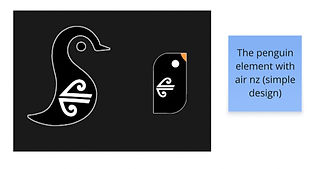
The North Wing - Logo Design
With the group's input and ideas, I was responsible for designing a logo that was suitable for our app and partnerships, incorporating all relevant elements.


My drawings ^^
Member 1's drawings ^^
Member 2's drawings ^^
After agreeing on components from each of our ideas, I put together the final outcome:
