NATT'S DESIGN JOURNEY
DES240 - Data design (coding one)
Note:
To see better, click on images :))
Final GIF Code
Context:
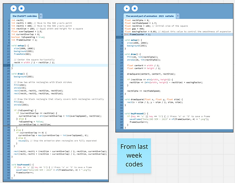
We had to pick a sustainable global goal (6 Clean water and sanitation), which I chose for freshwater. The specification was to create a geometric moving GIF that’s only black and white, which visually communicates the problem statement I selected from my chosen sustainable development goal. We achieved this by sketching and coding using the Processing tool (written in Java code), with guidance from YouTube and ChatGPT (OpenAI).
Design process (ideating & developing)
The process began with choosing Sustainable Development Goal (SDG) 6, ' Clean water and sanitation'. I wanted to explore an approach that I had not used in previous projects. Within this SDG, we are tasked with researching a statement (Figure 1) that can be visually portrayed using 2D geometrical shapes, while also maintaining the black and white aesthetic.

Figure 1
For my shapes, I initially decided to use curved shapes. However, considering it was my first time coding, I didn't have the skills required, so I had to simplify my idea. Below are the inspiration images that helped me develop my ideas. These images were primarily focused on how noisy I wanted to make the GIF and the movement approach. I drifted away from this type of design during modifications.


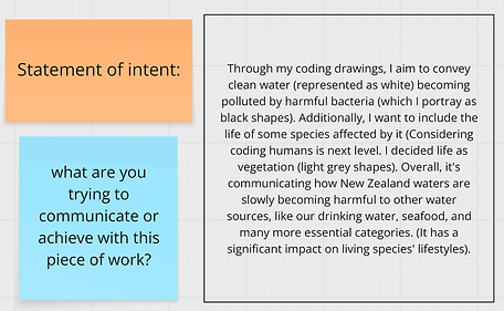
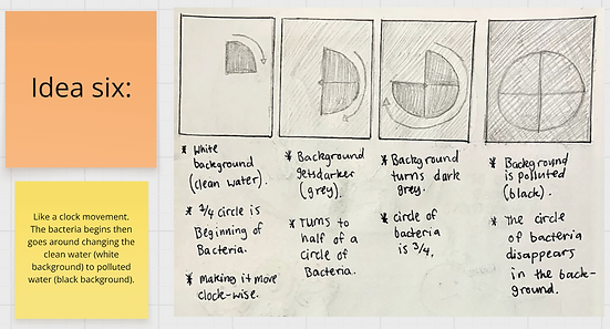
I drew ideas that I thought would communicate the idea of clean water transforming into polluted water.


Throughout this process, I had also practised beginner coding to familiarise myself with the code language functions. The full learning process is in Miro, linked at the top of the page.
Class/learning notes:


Processing Code Images:

Processing Codes:


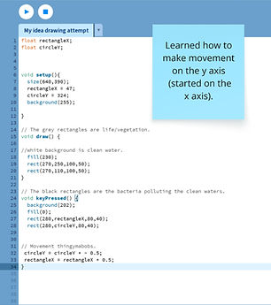

Due to the class teachings, I was more comfortable and familiar with using quadrilateral shapes, so I considered prioritising them when iterating my ideas.


Some iterations have a circular concept (1 & 7), specifically related to the human aspect of the main GIF. I discovered while drawing that sharp-edged shapes don't convey a "human" vibe, considering humans are more fragile; therefore, a curved shape would be more suitable. Additionally, considering too many of the same shape would confuse the viewer. It's essential to distinguish between different shapes.
Further developing these ideas to suit my ideal vision, I decided to play around with the elements I had. Here was my brainstorming break. Afterwards, I included the idea below (figure 2):
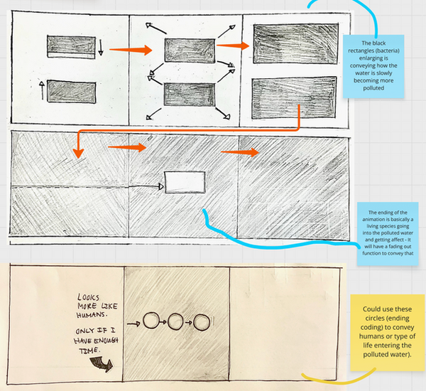
Figure 2
Processing Codes:


Processing Code Images:

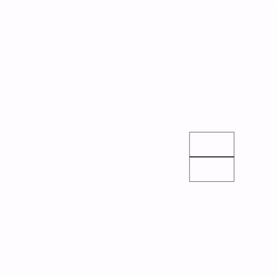
As it was challenging for me to work with three shapes — rectangle, square, and circle — I decided to stick with squares and circles when progressing. The coding skills I had were more aligned with squares than rectangles, considering it was more straightforward and simplistic to transition. Squares also make it easier to incorporate the 82% of pollution in NZ's clean waters.

Without the 82%

Coding process till the final idea: